A legal clause.
Not a life plan.
Across Indian IT services, ITES, ed-tech and aviation, employers routinely ask new hires to sign a service bond — a 1–3 year commitment backed by a forfeitable amount, in exchange for training, a laptop, or a sign-on bonus. It's standard paperwork on day one. Then it quietly becomes the backdrop to every decision an employee makes for the next several years.
Talking to bond-holders surfaced a pattern: nobody had built anything for the person living inside the bond. HR portals track compliance for the company. Job sites track the market. Nothing sits on the employee's side of the table.
- Give employees a single, private place to see exactly how much bond time is left.
- Remove the financial risk of missing a relieving-document deadline.
- Replace salary anxiety with an honest, year-over-year view of hikes and market value.
- A bond countdown that turns an abstract release date into a daily, visual number.
- A grouped, reminder-driven document checklist for before and after the last day.
- An automatic hike tracker and market benchmark, delivered through daily notifications — no manual digging required.
Find exact bond days remaining
To compare salary vs. market
SUS-style, n = 8
Moderated test group
What bond employees
never say out loud.
To avoid designing from assumption, research ran in two passes: a screener survey to size the pain quantitatively, and one-on-one interviews to hear the anxiety in people's own words. 42 respondents currently serving a service bond — IT services, ITES and ed-tech, tier-1 and tier-2 cities, 1–3 years into a 1–3 year bond — completed the survey; 8 were interviewed in depth.
Research summary: the surveys sized the problem — most bond-holders were flying blind on dates, documents, and pay. The interviews explained why: the bond isn't a task to complete, it's a low-grade condition people live with, and every existing tool was built for someone other than them.
Meet the person
living inside the bond.
Research converged on a single, sharply-defined primary user — synthesized from the interview pool rather than any one individual.
- Know the exact release date without asking HR.
- Leave with every document intact — no Full & Final surprises.
- Walk into the next negotiation with real market data.
- HR replies take days, if at all.
- No idea whether his last hike was fair.
- Compares notes informally with friends — trusts nobody's numbers, including his own.
Says
- "It's probably fine, I'll figure it out closer to the date."
- "My friend got a bigger hike, so I probably got underpaid."
Thinks
- "What if I forfeit more than I think if I leave a little early?"
- "Is HR even going to remind me about anything before my last day?"
Does
- Keeps a photo of his offer letter in his phone gallery.
- Manually notes his CTC in a phone notes app after every appraisal.
- Asks friends in a private group chat about hikes and offers.
Feels
- Quietly anxious and mildly distrustful of HR.
- Relieved — briefly — whenever someone else confirms his numbers seem fine.
Mapped as an anxiety curve across the bond lifecycle, not a single transaction — this is what made clear the product needed to live in the background, not just at the finish line.
The bond timeline is invisible — buried in a PDF offer letter, not front-of-mind anywhere.
Relieving documents carry real financial risk, but nobody tells you what to collect or when.
Hikes arrive as a single opaque number with no year-over-year or plain-language context.
There's no honest way to know if current pay is even close to the market rate.
| Capability | Notes / Excel | Naukri / Glassdoor | HRMS (Darwinbox, Keka) | Unbond |
|---|---|---|---|---|
| Personal bond countdown | ||||
| Grouped document checklist + reminders | ||||
| Plain-language YoY hike tracking | ||||
| Market value benchmark | ||||
| Private, employee-owned (not employer-visible) |
From a countdown
to a full companion.
The four opportunity areas needed to become a coherent structure before they could become screens — an information architecture, a set of flows, and a short list of interaction principles the whole product would answer to.
-
Onboarding
- Sign Up / OTP Verification
- Bond Details Setup
- Notification Permission
-
Home Dashboard
- Bond Countdown Ring
- Quick Stats Row
- Today's Reminders
-
Documents
- Before Last Day
- After Last Day
- Upload / Photo Proof
-
Salary & Hike
- Add Yearly CTC
- YoY Hike Chart
- Payslip Scan
-
Market Compare
- Role + Experience Input
- Percentile Gauge
-
Notifications
- Daily Digest
- Milestone Alerts
-
Profile & Settings
- Privacy & Data
- Reminder Preferences
- Export / Delete Data
Calm enough
to trust with your salary.
Unbond handles two things people are naturally guarded about — a legal contract and their pay. The visual language deliberately avoids anything playful or "growth-hacky," aiming instead for the restrained, almost bank-like confidence of the rest of this system.
 App Icon
Ink as the background — the same near-black used everywhere else in the product, so the icon reads as calm rather than alarmed. The white mark is a document with a jagged break running through it: the paperwork of the bond, visibly splitting apart. The tear is the message — the moment the document breaks is the moment the bond ends and freedom begins.
Set in lowercase, "unbond" — quiet and unforced. Copy stays plain and specific: "3 documents pending" instead of "Don't miss out!" — clarity over urgency, everywhere.
From scribble
to shippable.
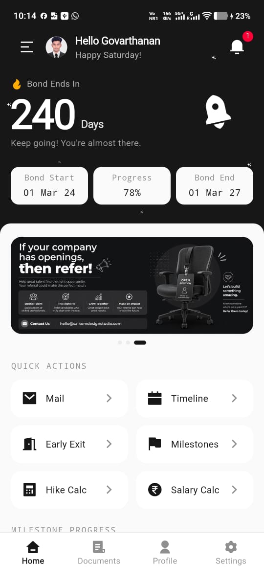
The Home Dashboard carried the most product risk — it had to communicate a countdown, three data points, and today's reminders without ever feeling cluttered. It went through four fidelity passes before it earned its final layout.
Six screens.
One companion.
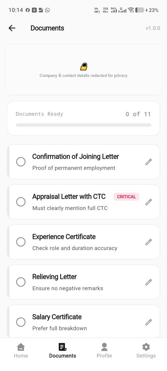
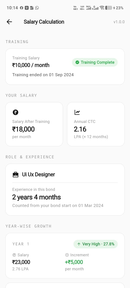
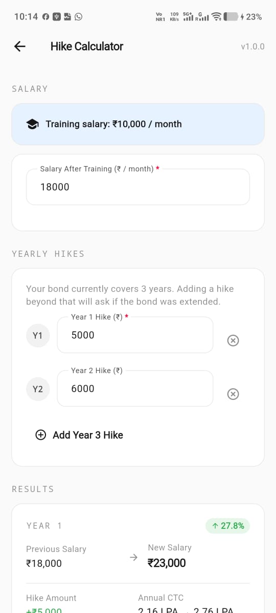
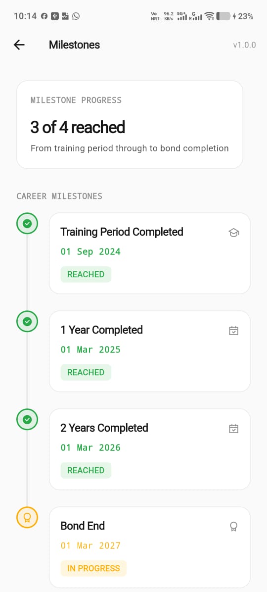
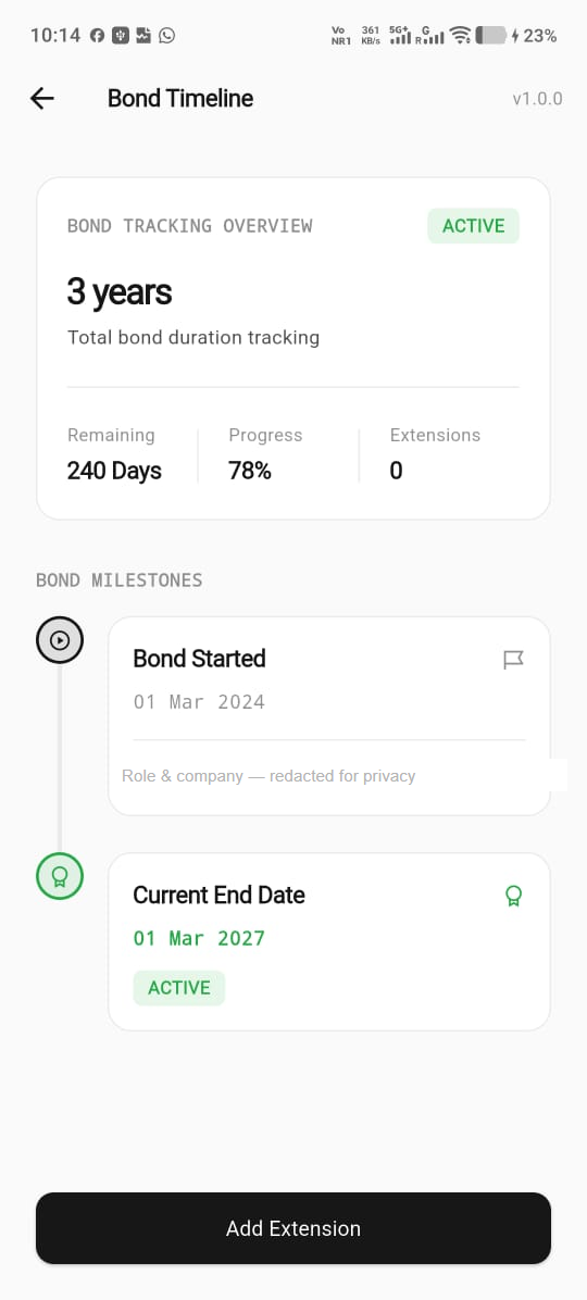
Every screen was built to be checked in five seconds or less — glanceable enough for a quick look between meetings, honest enough to sit with for longer when it matters. Screens below are from the live build; the Documents screen has its company and contact fields redacted for this case study.
Built to be
clicked through, not just looked at.
The full clickable prototype — onboarding through bond completion, including the countdown ring's fill animation and the document swipe gestures — was built in Figma and used directly in every moderated usability session below.
Prototype — Available on RequestThe ring animates its fill on every app open, reinforcing forward progress without a single extra tap.
A one-time celebratory animation the day the bond hits zero — intentionally marking the peak-end moment.
Swiping a document card right marks it collected; left snoozes the reminder — no modal required for either action.
Where the design
got it wrong first.
8 participants, moderated remote sessions, 5 core tasks — each participant currently serving a bond of their own, to keep the emotional stakes real rather than simulated.
| Task | Success Rate | Avg. Time | Key Finding |
|---|---|---|---|
| Find exact bond days remaining | 100% | 4s | Every participant read the ring correctly on first glance. |
| Add this year's CTC and read the hike % | 88% | 22s | One participant expected to paste a payslip photo, not type manually — led directly to the payslip-scan shortcut. |
| Mark a document as collected | 75% | 18s | The original flat, 9-item list caused overwhelm; grouping into Before/After resolved it. |
| Compare salary to market rate | 100% | 9s | The percentile gauge was understood by every participant without explanation. |
| Adjust a notification reminder | 88% | 14s | Settings sat two taps too deep in v1; promoted to a one-tap Home shortcut. |
- A single flat list of 9 documents, undifferentiated by urgency.
- Manual-only CTC entry, one field at a time.
- Reminder settings buried two taps deep in Profile.
- Grouped into "Before Last Day" and "After Last Day," each capped at 4–5 items.
- Manual entry plus a payslip-photo scan shortcut for faster logging.
- A one-tap reminder shortcut surfaced directly on Home.
What started as paperwork
ended as peace of mind.
Unbond turns a mandatory legal obligation into a transparent, trackable timeline — one countdown, one checklist, one honest number for what an employee's work is actually worth, delivered quietly instead of demanded loudly.
- Regional language support for tier-2 and tier-3 city hires.
- Anonymized peer salary benchmarking within the same company.
- Optional, opt-in HR-side integration for verified document status.
- Dark mode — explored, but deprioritized for this MVP scope.
Most of what people needed already existed somewhere — in an offer letter, a payslip, a job listing. Unbond's job was never to invent new data. It was to put it in one calm place someone could actually trust, on the days they were too anxious to go looking for it themselves.
Designed in Figma.
Shipped in Flutter.
Unbond isn't a clickable prototype dressed up as a case study — it's a real, production Flutter app with a live backend, push notifications, and a Play Store billing flow. Here's exactly what it's built on.